RUBICON’s entire corporate appearance was subjected to a comprehensive redesign in March 2018. The reputable IT service provider’s external and internal communication will in future appear in a contemporary and appealing design.
RUBICON has achieved continuous growth in recent years and has become a well-respected, medium sized enterprise with meanwhile 180 employees.
“Setting the next milestone in our corporate appearance and communication by introducing a corporate design was therefore only logical. The new corporate design will become visible over the coming months: at the new FORUM RUBICON meeting centre, on the website, at trade fairs and in brochures and other advertising means,”, says CEO Peter Grassnigg.
New design of the RUBICON logo

The new logo of the umbrella company RUBICON is the central element of the corporate design relaunch. Instead of the usual blue tone typical of the IT segment, the RUBICON word/image logo now appears in a strong yellow and contrasting black - together with the claim by which we live every day: "Inspirational software". The marketing team developed the corporate design and brand strategy in cooperation with design agency HammerAlbrecht.
Product brand strategy as a basis for license sales
Over the past years RUBICON has developed into a leading software enterprise serving international corporations and institutions in the public administration sector. A clear product strategy created the basis for developing a successful license sales business and a network of partners. A strict brand strategy and communication that builds on it are essential prerequisites in this regard. Hence the appearance of established products and services with new product logos.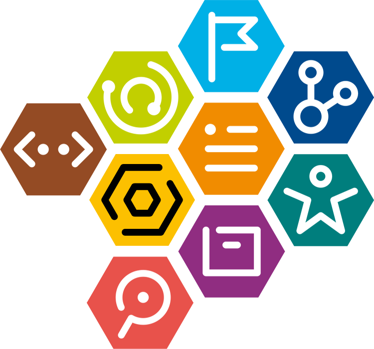
The brand makes the difference: it bundles the competencies that RUBICON stands for. It is a promise understood by customers, partners and employees. Good brands are unmistakable. They instil trust and confidence and contribute sustainably to corporate success.
Image and illustration style
The use of strong colour worlds and complementary colours (opposing colours on Itten’s colour wheel) in the new language of colour maximises the impact and colour force of the umbrella brand and corporate brand.


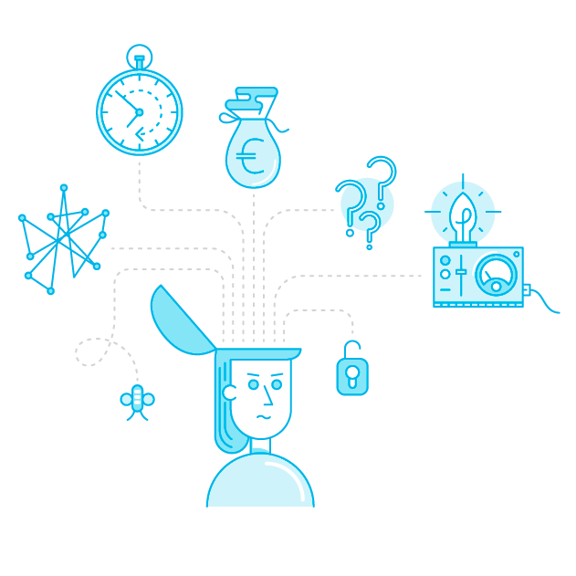
A specially developed illustration style that also works with product colours will in future be used to create simplified representations of complex processes. The collection of illustrations is flexibly extendible and scalable.
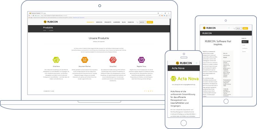
Website launch
Last but not least: rubicon.eu also shines resplendent in a new design.